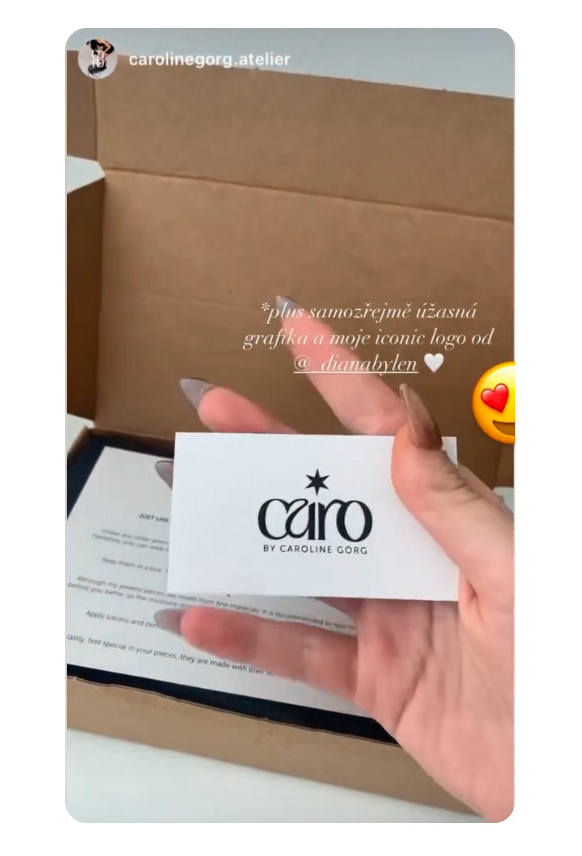
logo & identity
*
logo & identity *
Caro jewelry
About
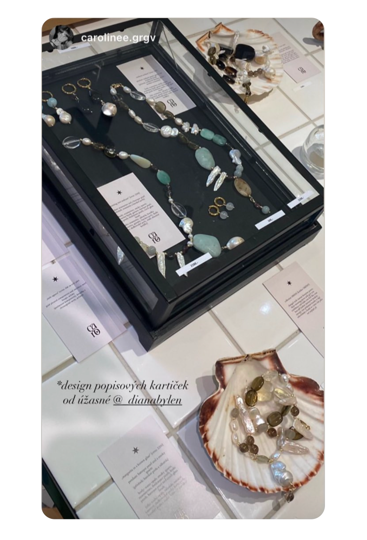
The visual identity was created for a Czech jewelry designer whose work is deeply connected to a personal symbol — the star. She has been using this symbol for years in her signature, so it’s making it an authentic and meaningful element of her brand. In the logo, the star becomes a key visual anchor, carrying both personal history and symbolism.


The logotype features a custom-designed typography created specifically for this project. The letterform subtly references the shape of an earring, directly reflecting Caroline’s focus on handcrafted jewelry while keeping the mark minimal and elegant.
The creative process was highly intuitive and collaborative. We began by getting to know each other and gradually translating Caroline’s personality, values, and aesthetic into a visual language. This organic approach allowed the identity to evolve naturally, resulting in a logo that feels personal, timeless, and true to the maker behind it.
The visual system was further applied across printed materials such as business cards and branded cards.